Introduction
Dashboards are excellent tools for consolidating and displaying important information, allowing for quick and efficient data analysis, and Excel is an amazing tool for creating dashboards because it is versatile, has advanced features, and is widely used in the business world. But have you ever wondered how Excel experts create dynamic and attractive dashboards that impress colleagues and clients? Well, the answer lies in the combination of technical skills with good design and formatting practices.
In this article, you will discover the 5 secrets to creating dynamic dashboards in Excel and enhance your skills in data analysis and visual presentation. But before we dive into these secrets, it’s important to explain what a dynamic dashboard is.
What is a dynamic dashboard?
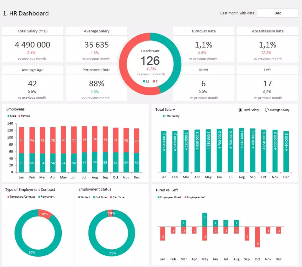
A dynamic dashboard is a visual communication tool that allows the user to interact with the dashboard data and manipulate it to gain further insights from the data set in question. In Excel, for example, it is possible to use data segmentation, form controls, pivot tables, and dynamic charts to make the dashboard interactive.
Although Excel offers some functionality for creating interactive dashboards, other data visualization tools, such as Power BI, have more advanced features in this regard, allowing for drill down and drill through, using Tooltips, and configuring the visualizations to interact with each other in a dynamic and integrated way.
Why You Should Create Dynamic Dashboards in Excel
By creating dynamic dashboards in Excel, users can analyze data more efficiently, avoiding the need for complex manipulations and eliminating the need to access multiple reports to obtain different perspectives on the data. For example, the user does not need a specific report for each sales year or for each salesperson. Instead, they can use filters within the dashboard itself to select the desired year or salesperson whose data they want to analyze. This approach simplifies analysis and speeds up decision-making.
Furthermore, when well-structured, dynamic dashboards developed in Excel give a more professional look to the presentation of information, making a good impression on bosses and colleagues. The developer of the dashboard, by creating effective and visually appealing solutions, can stand out within the company and increase their professional recognition.
The 5 Secrets to Creating a Dynamic Dashboard in Excel
Secret #1: Pivot Tables and Pivot Charts
Excel Pivot Tables are powerful and flexible tools for analyzing and summarizing data. They allow for extracting meaningful insights from large datasets, organizing them in a concise way, and presenting them in a tabular format that can be easily manipulated and adjusted.
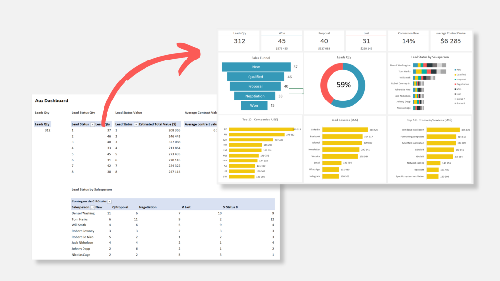
Due to this effectiveness and other advantages, Pivot Tables have been essential in creating dynamic dashboards that I have developed in Excel for several years. Even though they are not directly visible on the dashboard, they play a fundamental role in organizing and feeding information.
To achieve this, I usually insert Pivot Tables on a specific sheet in the Excel file, called “Auxiliary,” which serves as a base for transmitting data to the dashboard. Additionally, it is on the Auxiliary sheet where I create data slicers and Pivot Charts. After creating them, I cut (CTRL+X) these elements from the Auxiliary tab and transfer them (CTRL+V) to the Dashboard tab, thus ensuring the tool’s interactivity.

Reasons to Use Pivot Tables in Dashboards
- Flexibility: Pivot tables allow for grouping, sorting, and filtering data in various ways, which enables adjusting the analysis to the specific needs of each dashboard.
- Interactivity: Pivot tables also allow for using data slicers to filter and interact with the information presented on the dashboard.
- Automatic updating: when data sources are updated, Pivot Tables also update automatically, thus ensuring the dashboard information is up-to-date.
Moreover, if you are using Power Pivot, it is possible to create calculated measures in the Pivot Table using two or more existing columns to create a custom indicator with the DAX language. The use of Power Pivot and DAX in Excel significantly enhances the power of Pivot Tables.
Secret #2: Data Slicers
The second secret to creating dynamic dashboards in Excel is the use of Data Slicers, which are features that allow for quick and efficient filtering and interaction with dashboard data. Data slicers enable analyzing different perspectives of the data presented on the dashboard with just a few clicks, making the user experience more agile and intuitive.
Additionally, it is possible to filter multiple pivot tables simultaneously using a single data slicer. To do this, you need to connect the data slicer to all the pivot tables you want to filter simultaneously. This ability to filter multiple pivot tables at the same time makes the use of data slicers even more powerful in creating dynamic dashboards in Excel.

Secret #3: Form Controls
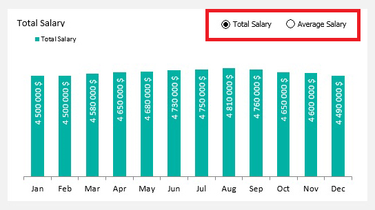
The third secret to creating dynamic dashboards in Excel is the use of Form Controls. These tools are available in the Developer toolbar and allow you to add interactive elements to the dashboards. Through form controls, you can insert buttons, checkboxes, drop-down lists, combo boxes, and other elements, making the dashboards more dynamic and interactive.

When using form controls in dashboards, you can link them to specific cells or use VBA code to perform more complex actions when the user interacts with the form elements. This approach significantly expands the possibilities for interaction and customization of the dashboards.

Examples of using form controls in Excel dashboards
- Buttons: You can add buttons to perform specific actions, such as refreshing data, filtering information, or switching between different data views.
- Checkboxes: They can be used to allow the user to select or deselect specific options within the dashboard data, such as showing or hiding data series in a chart.
- Drop-down lists: Ideal for allowing the user to select an option from a predefined set, such as a time period (month, quarter, year), or a specific department in the company, automatically updating the dashboard data based on the selection.
- Option buttons: Useful when you want the user to select only one option from a predefined set of options. For example, you can create option buttons to select different product categories, updating the dashboard data according to the chosen category.
Secret #4: Lookup and Reference Functions
The fourth secret to creating dynamic dashboards in Excel is the use of lookup and reference functions. These functions are essential as it may not always be possible to create direct links with pivot tables, requiring the retrieval of information from other cells or areas of the worksheet.
Some of the lookup and reference functions that I frequently use in dashboard creation include:
- VLOOKUP: Is a function used to search for a value in the leftmost column of a range and retrieve a corresponding value from a specified column. It is commonly used for vertical lookups in Excel.
- HLOOKUP: Is similar to VLOOKUP but performs a horizontal lookup. It searches for a value in the top row of a range and retrieves a corresponding value from a specified row.
- SUMIF: Is a function that adds the values in a range based on specified criteria. It allows you to sum values that meet a specific condition or criteria.
- INDEX: Is a versatile function that returns the value of a cell within a specified range based on its row and column number. It is often used in combination with other functions to retrieve specific data points.
- MATCH: Is a function used to find the relative position of a value within a specified range. It is commonly used to locate the position of a value and retrieve corresponding data.
These functions are powerful tools in Excel that enable data lookup, retrieval, and analysis, contributing to the creation of dynamic and interactive dashboards in Excel.
Secret #5: Design and Formatting
The fifth and final secret to creating dynamic dashboards in Excel is Design and Formatting, which are fundamental elements in dashboard creation as they directly impact the comprehension and usability of the presented information. A well-designed and formatted dashboard allows users to quickly find the information they are looking for and understand the data clearly.
A good dashboard design involves the proper choice of colors, fonts, and spacing, ensuring that the dashboard is visually pleasing and organized. Additionally, proper data formatting, such as using conditional formatting, charts, and tables, contributes to the effective visualization of the dashboard information.

Conclusion
In summary, in this article, we have covered the 5 secrets to creating dynamic dashboards in Excel. By applying the techniques and tools presented in this article, it is possible to develop dynamic, interactive, and visually appealing dashboards in Excel. Mastering these secrets will enhance your skills in creating dynamic dashboards using Excel.
About Adnia Solutions
At Adnia Solutions, we specialize in creating dashboards and spreadsheets in Excel with unmatched excellence. Our team of experts is dedicated to crafting dynamic and visually stunning solutions that empower businesses to make data-driven decisions.
Visit our spreadsheet store, where you’ll find a wide selection of over 120 professionally designed templates in Excel. Whether you need financial models, project management tools, or performance dashboards, our templates are meticulously crafted to meet your specific needs.
Unlock the full potential of Excel and take your data analysis to new heights. Explore our spreadsheet store today and discover the power of our Excel templates. Visit us at adniasolutions.com and elevate your business with Adnia Solutions.


