Introduction to Dashboard
1. Introduction to Dashboards
1.1. What is a dashboard?
The most accurate definition would be that of Stephen Few, founder of Perceptual Edge and renowned innovator in the fields of business intelligence and information design: “A dashboard is a visual display of the most important information needed to achieve one or more objectives; consolidated and arranged on a single screen so the information can be monitored at a glance.”
Basically, this information management tool offers you a comprehensive view of KPIs, metrics and other key data points which may be relevant to your business, department or any specific process. Unlike reports though, they simplify complex data sets with the help of data visualizations. Therefore, they allow you to learn much more without wasting your time reading pages after pages.
“A dashboard is a type of display, a form of presentation, not a specific type of information or technology.” Stephen Few (from Information Dashboard Design: Displaying data for at-a-glace monitoring, 2013.
1.2. Dashboard Examples
1.2.1. Good Examples


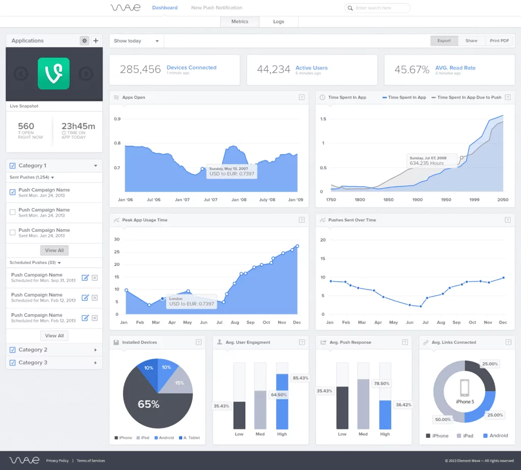
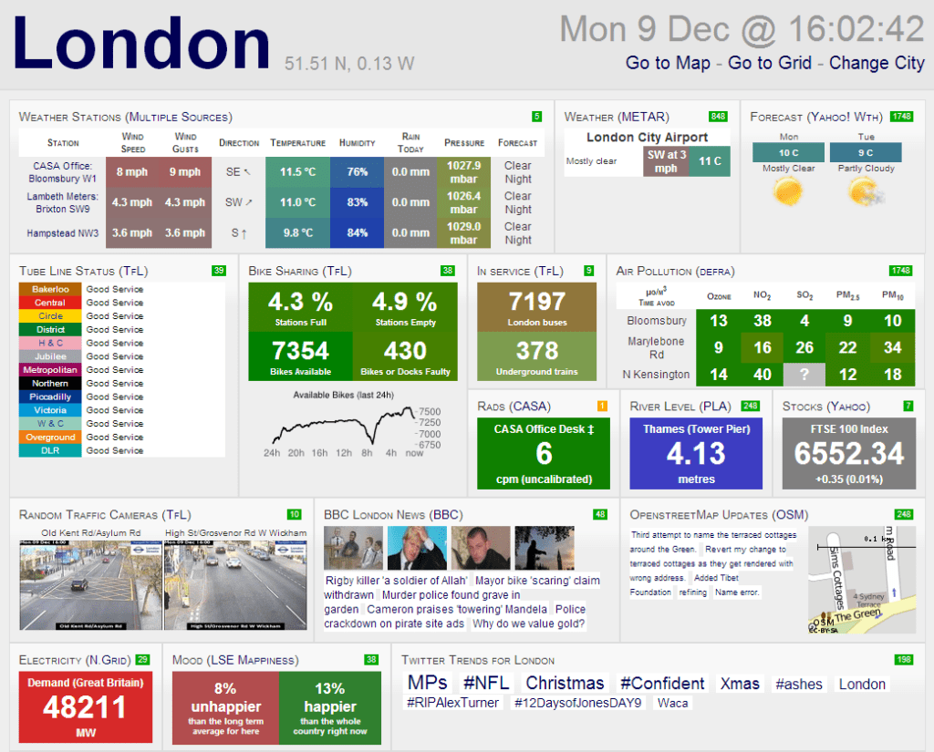
Dashboard designers can learn a lot from good dashboard designs. Wave and Wufoo are both examples of well-designed dashboards.
The Wave dashboard is visually appealing, but it isn’t distracting. Viewers easily take the data in without having to make it through unnecessary graphics. They also don’t have to deal with unnecessary data. It is straightforward and has the right amount of data.
This dashboard also has a nice color scheme. It’s clean and clear, and the bright colors pop off the page. The color scheme enhances the dashboard and makes it easier for people to digest the data.
The Wufoo dashboard is also visually appealing, but unlike the Wave dashboard, it provides additional data. People can glance at this dashboard to get a basic overview or they can drill down to get additional information about each value presented. Users can select a specific value or area of interest and then learn more about it. People also have the option to use filters when analyzing the data. The filters make it easy for them to access the necessary data.
1.2.2. Bad Examples


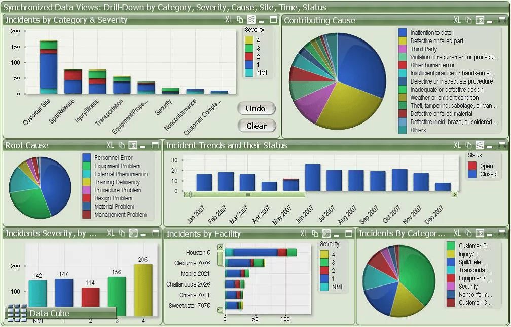
Designers also need to look at bad dashboards in order to know what to avoid. The dashboards pictured are both examples of poorly designed dashboards.
Both of these dashboards are full of distractions. They have too much information so people can’t glance at them and take it all in. They also have too many colors, making it difficult for people to concentrate on the values presented.
In addition, the first dashboard has too many elements. The designer included images, text, and maps. People cannot digest all of this information. It just creates a distraction.
The second example is full of pie charts. Pie charts are hard to understand. People cannot glance at pie charts and get the necessary information.
1.3. Why use dashboards?
Companies have access to countless metrics. These metrics are incredibly detailed and can take days to sift through. If companies were to go through all of the data, it would take weeks to make a decision. Dashboards take the complexity out of the process by compiling companies’ most important metrics on one screen, giving everyone access to the same information.
This allows entire teams to quickly look over the most important metrics and make fast decisions. It also allows teams to check on their companies’ progress and determine what is working and what isn’t.
Possibly most importantly, the dashboard allows companies to define the key metrics right out of the gate. At a time when companies can collect more data than ever before, it is easy for employees to forget about what is most important. They put the same weight on all of their KPIs, which causes them to lose track of their key goals. With a dashboard in place, they get a daily refresher on what the company values. Then, they use those metrics to gauge their individual performances. That helps them reach their goals and improve the bottom line for the company as a whole.
If a company is going to succeed, a dashboard is a must. It streamlines the decision-making process and makes it easier to define and achieve goals. It is one of the most important keys to a company’s success.
1.4. Types of Dashboards
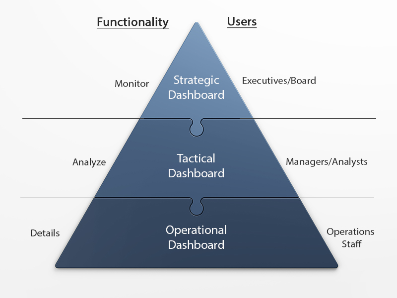
Dashboards are traditionally divided into three categories:
Strategic Dashboards – Used mainly by managers and executives at the organization, these dashboards display information linked to the health of the organization. They can also be used to identify growth and improvement opportunities. Keep in mind that you’ll need to carry out further analysis since dashboards only give you a snapshot of what to expect.
Analytical Dashboards – By allowing comparisons across time and different variables, these dashboards help users understand trends and why certain events took place. However, expect them to be quite complex in comparison with the other two types, especially as their goal is to ensure understanding at the end of the day.
Operational Dashboards – An operational custom dashboard helps in monitoring real-time operations using Stream processing software to record and identify large data volumes before alerting users about deviations to the norm. This usually means frequent updates, less information than the first two types, and fewer to no errors due to deviation from established standards.

1.5. Key Characteristics of a Dashboard
Whether you’re using a marketing dashboard or a performance dashboard, you’re bound to notice some similarities when it comes to characteristics.
- All visualizations can easily fit on a single computer screen since scrolling goes against the “consolidated” structure dashboards should have.
- The most important performance indicators which need constant monitoring are on display.
- Functions such as filtering and drill-down may be offered, but they shouldn’t be necessary to identify which KPIs aren’t performing optimally.
- They should be easy to understand regardless of which position the employee holds in the organization.


